"Personal Color Analysis for Korean Women’s (For women in their 20s and 30s)" Min-kyoung Kim, KMK color Institute, Seoul, South Korea (Republic of Korea)
In modern society, it is becoming important to establish individual characteristics and unique personal identities. As a result, the Personal Color sector has already settled in the beauty and fashion industries.
The purpose of this study is to analyze in personal color whether the color decided according to the fashion color is suitable for Asian people. Even if it is the same color, the color that matches the seasonal color tone is different.
The purpose of this study is to analyze the colors that match Asian people 's favorite colors. If we research and analyze color preferences, we will be able to use trend color and personal color effortlessly in the future,
The goal of this research is to investigate the internationally renowned, and Korean stars’ fashion and make up of K-POP.
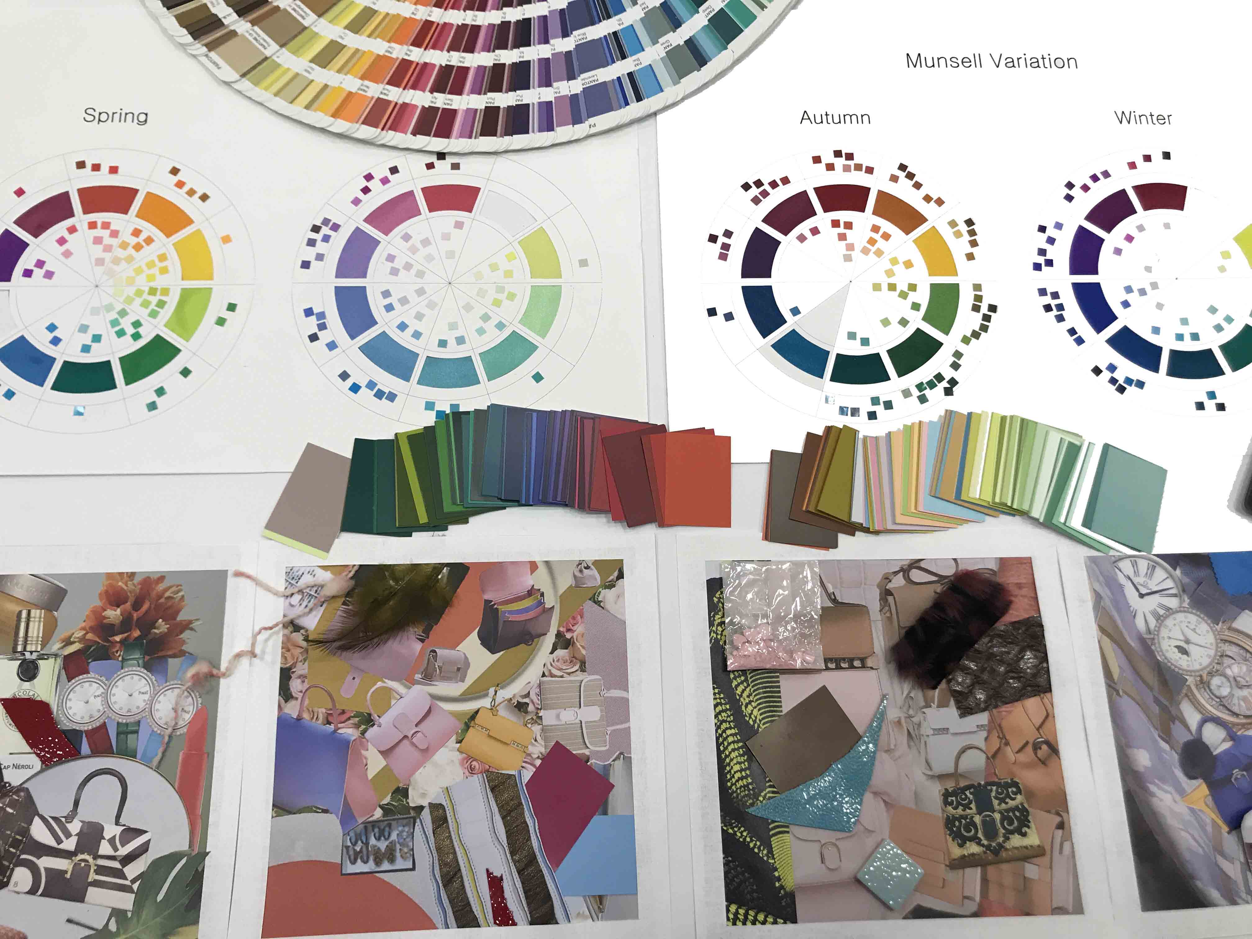
In order to know the personal colors that Asian women' s are looking for, it is necessary to analyze the color of the four seasons and diagnose the color to match. The personal color diagnosis system consists of 1: 1 individual consulting and image-making through styles, images and beauty make-up through personal color analysis.
Profile
Ms.Min-kyoung Kim
Korea’s 1st Colorist
Korea KMK Color Research Institute / Design Center (CEO)
Korea Society of Color &Personal Identity (president)
Ecole de Marge Verlair Korea (CEO)
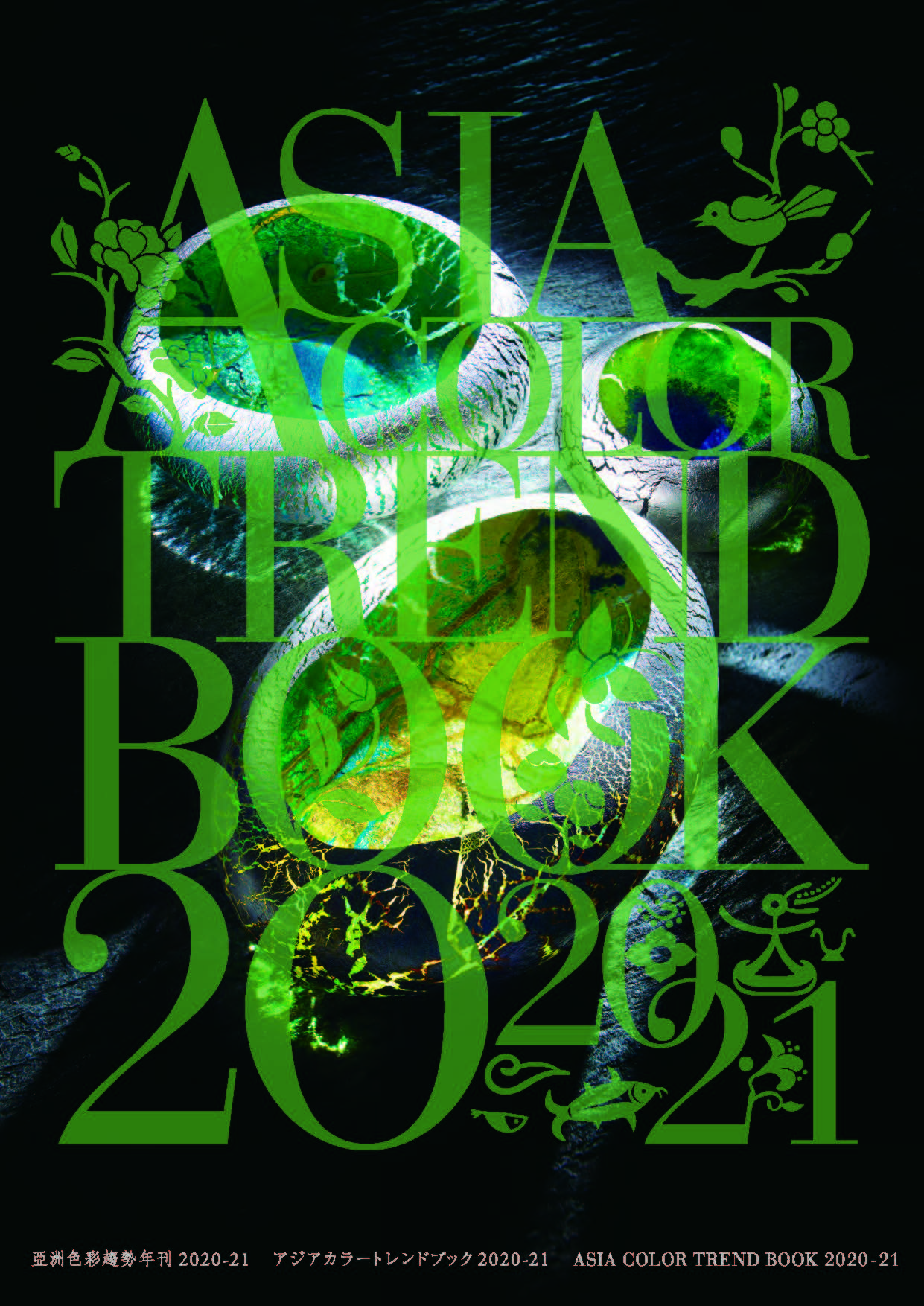
"Asia Color Trend Book" Eri Omae (Zhou Xin), DIC Color & Design Inc., China
With the increasing importance of Asian markets in the world economy, re-explore Asian culture and philosophy, the relationship between Asia and the world achieved structural transformation. “Asia Color Trend Book” published since 2008, as a world's only trend book focused on Asia, continue to disseminate the compactness and sense of humor, ambition and vitality of Asians, forecasting visual, color and material trend. (http://www.asia-color-trend.com/)
Profile
Ms.Eri Omae (Zhou Xin)
Editor-in-chief of Asia Color Trend Book / Creative director of DIC Color & Design Inc./Art director of Jinze Arts Centre (China)
"Vision Experiment on Perception of Correlated Colour Temperature" Youngshin Kwak, Ulsan National Institute of Science and Technology (UNIST), South Korea
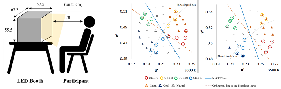
The correlated color temperature (CCT) is widely used to describe the colors of display whites. The users can easily estimate the color of the display white based on CCT information. High CCT such as 7,000K means blush white and low CCT such as 4,000K means yellowsh white. However current CCT calculation method doesn't match with the visual appearance. Our study shows that CCT is highly correlated with warm-cool feeling of the white color, where warm-cool feeling is determined based on hue perception mainly. A series of hue perception experiments using the color stimuli near Planckian locus indicates that the orthogonal line from the Planckian locus in CIE u'v' chromaticity diagram can be used as the perception-based iso-CCT.
Profile
Dr.Youngshin Kwak is the associate professor at Human Factors Engineering Department, Ulsan National Institute of Science and Technology (UNIST), South Korea. She received her PhD from the Colour & Imaging Institute, University of Derby, UK, in July 2003 and then worked for Samsung Electronics. In February 2009, she joined UNIST. Prof. Kwak is currently CIE Division1 (Vision and Colour) director.
"Color Perception Specific to Facial Skin" Yoko Mizokami, Chiba University, Japan
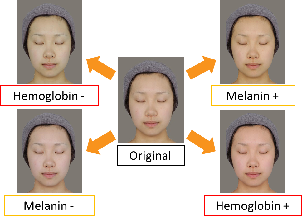
Skin color is essential for obtaining various information on our mind and body, such as health, age, and face impression. Therefore, we must have developed visual sensitivity tuned to skin. It has been suggested the existence of color perception specific to facial skin. For example, we have showed that sensitivity to changes in reddish (or hemoglobin increasing) direction of the skin is better than other color directions. Reddish skin looks brighter than yellowish skin even if they have the same lightness. These perceptions may link to the property of skin color determined by pigments of skin. Our results of international comparison also suggest that other factors such as ethnicities, environments, and cultures may also influence facial color perception.
Profile
Dr. Yoko Mizokami is a Professor in the Department of Imaging Sciences, Graduate School of Engineering, Chiba University. She received a Ph.D. in Engineering in 2002 from Ritsumeikan University. After finishing a postdoctoral fellow at the University of Nevada, Reno, Department of Psychology, she moved to Chiba University in 2006.
"Image-based Measurement of Human Skin Color and Its Application in Cosmetics Field" Kumiko Kikuchi, SHISEIDO Global Innovation Center, Japan
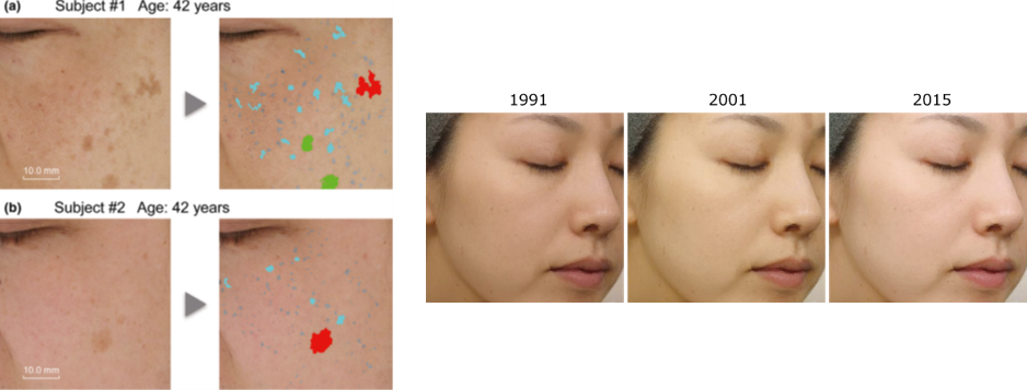
Understanding the skin color and skin color heterogeneity is important for many industries, especially in the cosmetics and esthetic fields. For objective measurement of skin color, the tristimulus colorimeter and reflectance spectrophotometer have been used for more than 50 years. In addition, various image analysis methods have been developed for quantitative evaluation of the skin color heterogeneity. Facial skin pigmentation is one of the causes of skin color heterogeneity and often affects perception of health and beauty. In order to characterize the individual pigmented spots within a cheek image, we established a simple object-counting algorithm and provided precise information on pigmented spots such as variations in size, color shade, and distribution pattern. In this presentation, some recent results of our research which relate to skin color and skin color heterogeneity will be introduced.
Profile
Dr.Kumiko Kikuchi is a research scientist at SHISEIDO Global Innovation Center, Japan. She received a Ph.D. in Engineering in 2016 from Chiba University. Her research interests lie in skin color, including skin color perception, development of measurement methods and spectral imaging of human skin.
"Chromatic Adaptation to Illumination" Chanprapha Phuangsuwan, Color Research Center, Rajamangala University of Technology Thanyaburi, Thailand
I like to demonstrate that the chromatic adaptation takes place to illumination not to color of object based on the concept of the recognized visual space of illumination RVSI developed by Ikeda. The concept emphasizes the chromatic adaptation to the illumination that fills a space where a subject stay. A flow chart of this action is (1) to recognize a space, and (2) to understand the illumination in the space. Pungrassamee et al. (2015) showed that color appearance of physically achromatic patch depends on illumination of a space where a subject stay by using two rooms technique. Phuangsuwan et al. (2013) showed that the color constancy occurs even in a 2D picture if a subject recognizes a space in the picture and understands the illumination in the space. Recently we investigated the simultaneous color contrast for various devices; a paper, a projector, a display and a real scene (two-room technique) and explained the device dependent color contrast by the strength how much a subject transfer the color on devices to illumination. The same explanation was successfully applied to the simultaneous color contrast in after image and in a colored paper covered with a tissue. Keywords: Chromatic adaptation, adapt to illumination, RVSI Theory, Devices, 2D picture
Profile
Dr.Chanprapha Phuangsuwan
Received a Ph.D. at the Faculty of Science, Chulalongkorn University, Thailand in 2012 and returned to Rajamangala University of Technology Thanyaburi (RMUTT) as a lecturer, presently an assistant professor. The research interest is to investigate the color appearance of objects in relation to the space recognition. I serve the director of Color Research Center CRC of RMUTT.
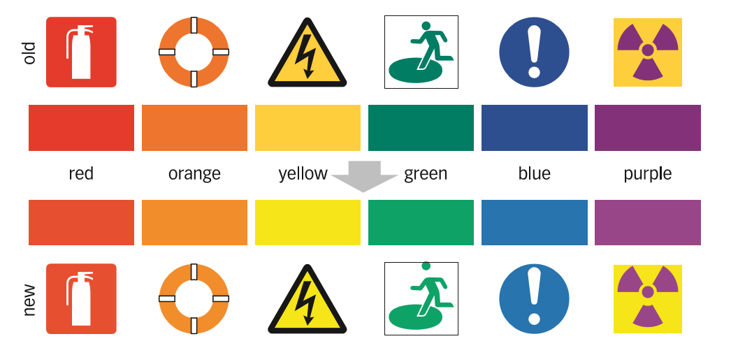
"Best Colors for Safety Signs" Kei Ito, University of Cologne, Germany
Signs that convey information about danger and disaster must be painted in the colors that all kinds of people can recognize unambiguously. Special care should be taken for the people with color blindness, low-vision, cataract, and aged, because they have difficulty distinguishing certain ranges of colors. Colors convey certain meaning, for example red for danger and green for safely. We therefore cannot “change” the colors for safety signs. However, by carefully adjusting the hue, saturation and brightness, colors can become much more distinguishable even for those people. The Japanese Industry Standard (JIS) for Safety Colors and the colors for the disaster information system of the Japan Meteorological Agency and TV broadcasters have recently been revised towards this aim. The concepts and backgrounds of these revisions will be explained.
Profile
Professor at the University of Cologne, Germany. He got his PhD for neuroscience at the University of Tokyo. After working at various institutes in Germany and Japan he became Associate Professor at the University of Tokyo before moving to Cologne. He studies sensory processing system of the brain as well as Universal Design of color and vision.
"Japanese Color Terms Denoting the Aesthetic Sense of Japanese Culture" Kohji Yoshimura, Kansai Gaidai University, Japan
In different regions and countries, it is thought that there are some important colors exemplifying that area. In other words, in any region the people there can have some colors or color combinations that are commonly appreciated, valued, and employed in a certain way. However, the actual colors in this world vary significantly. There are really no colors and color combinations that are not found in other regions and countries. In Japan there are colors considered representative of the culture such as indigo (expressing ‘Japanese blue’), browns and mouse colors called the “forty-eight browns and 100 mouse colors” in literal English translation (in reality, more than 100 browns and mouse colors are included in these Japanese color terms), and red and white indicating celebration.
Profile
Professor emeritus of Kansai Gaidai University, and part-time lecturer at Kansai University. He serves as a consultant to the Kansai Branch of the Color Science Association of Japan, and is on the board of the Japan Society of Stylistics and the Association for Japanese and English Language and Culture.
“From Vernacular to Divine Classics: A New Color Survey Approach” Tien-Rein Lee, Huafan University, Taiwan Vincent Ching-Wen Sun, Chinese Culture University, Taiwan
Surveys of color can be accomplished with a variety of ways, from questionnaire rating to self-painting target colors. Different survey methods aim to explore different aspects about “color,” which carries dissimilar meanings for variable research approaches. The present study suggests a new color survey approach which aims to find corresponding colors for a variety of items and reveal the color categories in them. We applied the basic color category investigation method of Sun and Chen (2018), which is based on the surveying procedures for basic color term by the World Color Survey (WCS) project. In our new color survey approach, we expand the survey to the color related terms found in ancient Chinese religious texts and also in western scriptures.
Profile
Prof. Lee was President of the Chinese Culture University from 2003 to 2009, and has acquired this position again from August 2013 to January 2018. He is now the President of Hua-fan University in Shihding, New Taipei City, Taiwan. As the Founding President of the Color Association of Taiwan (CAT), Prof. Lee is a color research pioneer establishing color studies and color application networks in Taiwan, with China, Asia, and worldwide. He has taken position of International Color Association (AIC) President in 2018.
Dr. Vincent Ching-Wen Sun is assistant professor at the Department of Mass Communication, Chinese Culture University, Taipei, Taiwan. He studied color vision with professors Joel Pokorny and Vivianne Smith, at the University of Chicago, and received his Ph.D. on 1998. Dr. Sun joined the Chinese Culture University in 2000. In addition to his department, Dr. Sun is also serving at the Center for Visual Communication and Color Research of the University, and the Color Association of Taiwan.